BOOMTOWN BREWERY
BrandING + CAN DESIGNS
Since 2012 I have been working with Boomtown Brewery in DTLA, painting murals, designing cans and in 2024 had the pleasure of helping them in establishing the look and feel for the their core series of beers.
In addition I’ve helped create merch, special edition cans, and marketing tools. The boys at Boomtown are some of the best in the business, making delicious beers, and just being all around good people.
What they felt like they were in need of was a cohesive design language to tie together their most popular beers. We are really stoked to see it all come to life, and we feel it really stands out in a crowd of craziness.
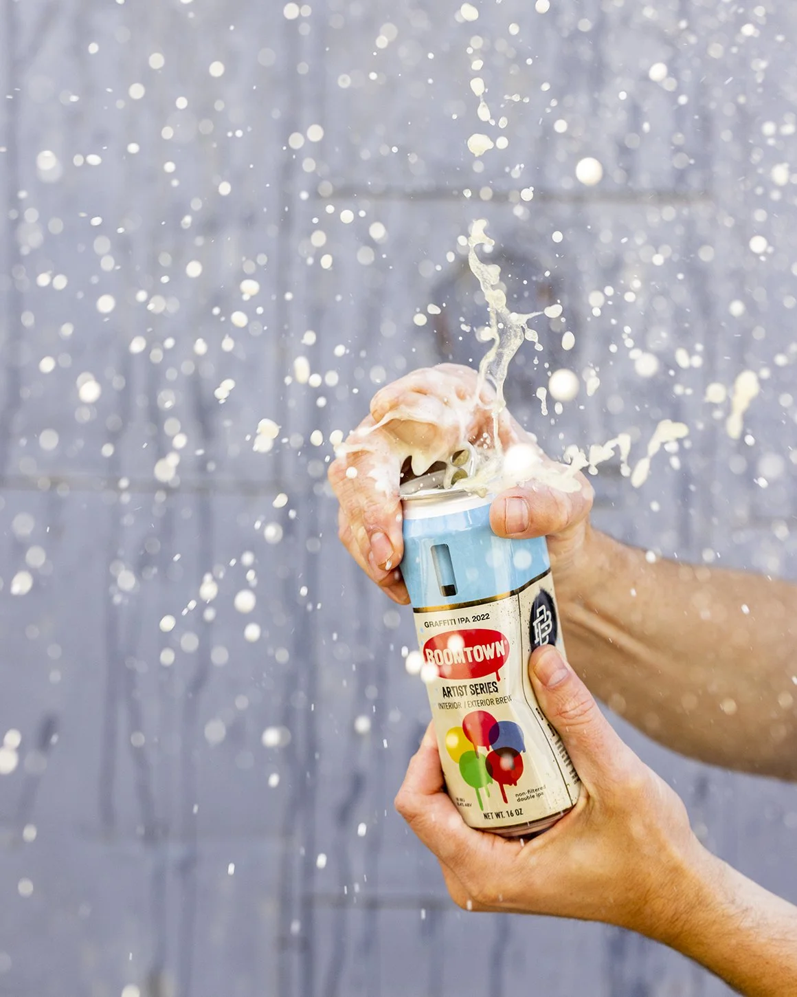
Of course besides the brand update, I have had the pleasure of designing numerous special editions for Boomtown. Some of them like Graffiti IPA have become a treasured beer, based on old school graffiti cans. Which I love!


While doing a strategic analysis of the Boomtown Brewery brand, we decided a large part of their DNA had to do with the idea of artistry and craft. When they first opened, they had graffiti artists (myself included) rock the whole building with artwork. I myself painted a golden owl. They wanted to keep their BB monogram, but wanted to play around with some ideas to frame it.
We landed on a drip being a good visual representation of artistry, signifying hand made. The band to hold the logo and monogram was created as a way to bring together different beers under a unifying design. Creating a consistent brand presence on the cans. The remaining space below would contain all of the beer’s name and information.
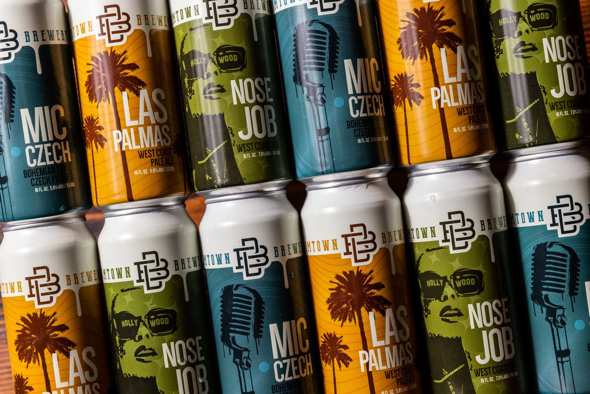
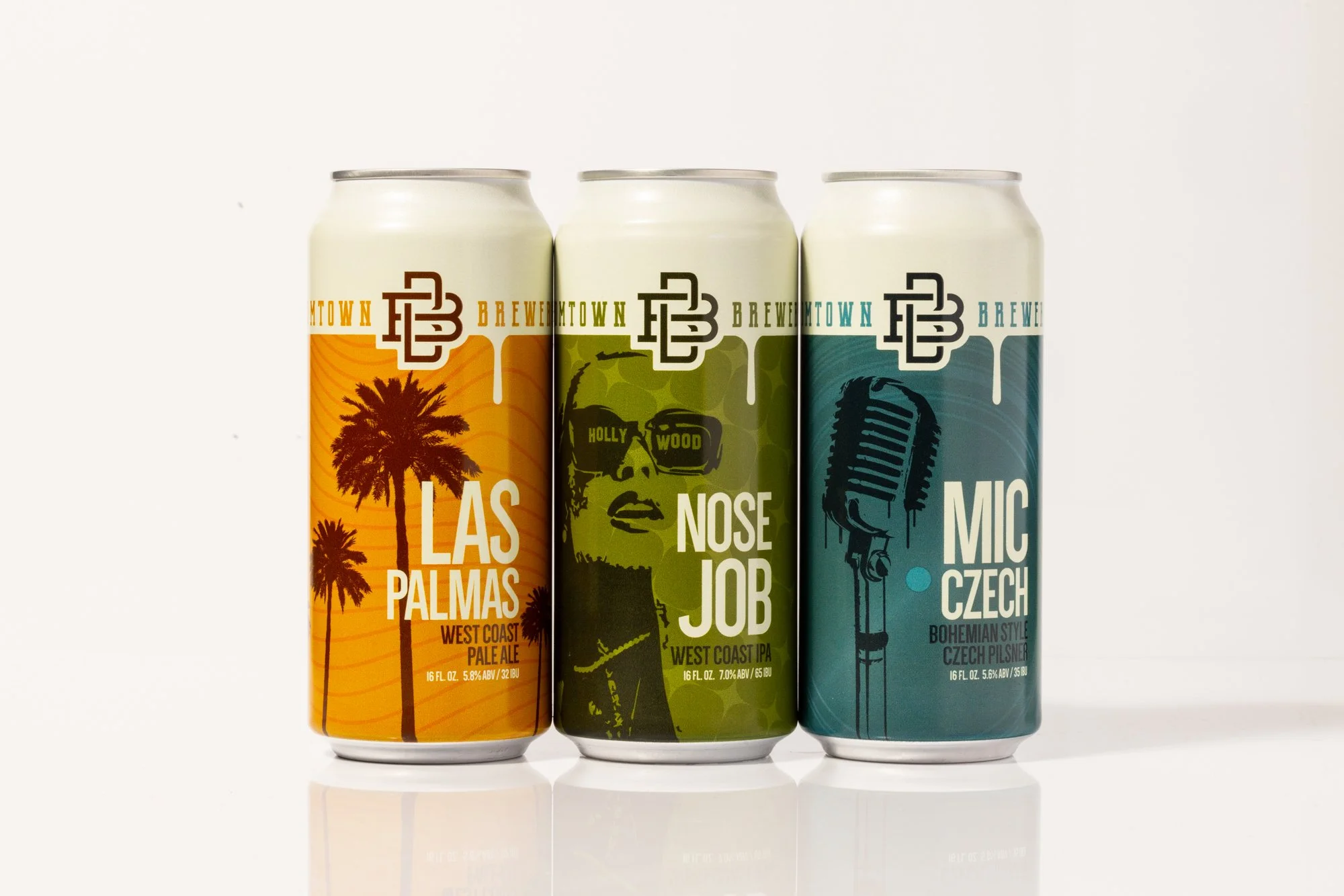
In our conversations regarding the look and feel of the brand, we decided that we could use a graffiti stencil look for the imagery of the cans. Based on the unique names of the beers, I created custom imagery in the stencil format. We wanted bold and edgy, but sophisticated in composition. The stencil imagey was paired with a textural element for each can. Nose Job being a star pattern, Mic Czech, the concentric lines of a record, and Las Palmas, smooth undulating lines reminiscent of a warm breeze.

Color was a huge concern with our shelf status. In our research of what the typical beer shelf looks like, we definitely noticed a sea of crazy colors. It seemed like it would be better to consider colors for our brand that were classic, and classy, but still bold and definitely not typical. The colors we landed on felt really good. Great hand appeal, and most importantly, it felt like we were being authentic to who we were as a brand. Not going crazy with pink and neons just to get attention. Standing out doesn’t mean being different, it means standing up and believing in yourself.

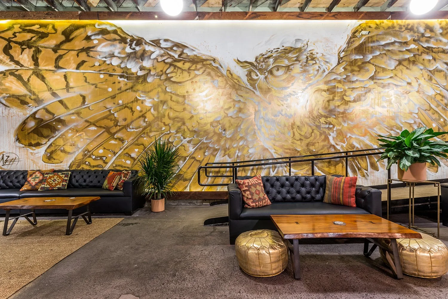
TAP ROOM ART
The first work I did at Boomtown was this Golden Owl for the tap room. It was an experimental piece for me at the time, using different gold paints was very challenging. At night when the lights reflect off of the wall it gives such a nice warm glow in the room.
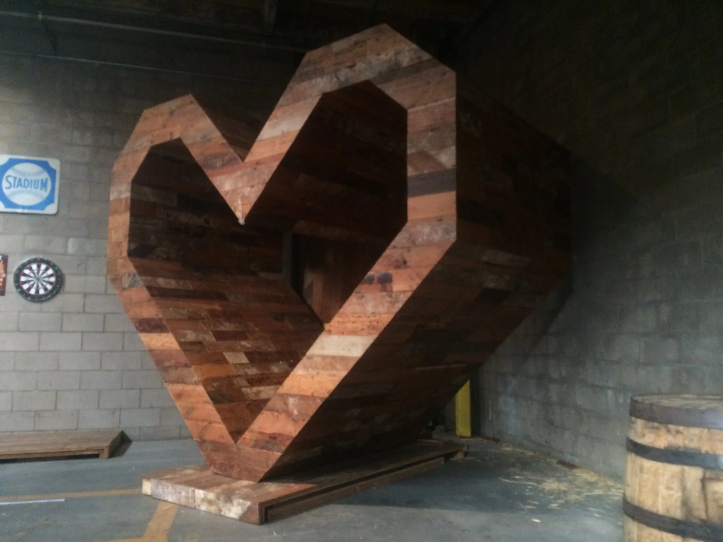
The heart to the right you may recognize if you know my work. It comes from a Toyota Fathers day project. When we were dismantling the artwork, I didn’t want to destroy the heart. Thankfully John said that would be super cool to have in the brewery, And its become an iconic part of the space.
DESIGN WORK
Here are just a few of the designs I have had the honor of being able to create for Boomtown.
Mo2 was my first design. Graffiti IPA was my most popular design, and as we did the rebrand, we revised some beers to fit the new look.
For their most popular beer Bad Hombre, we gave it a bit of a refresh in typography, even doing a few special edition cans.
The Hollywood Bowl can was especially fun. I was able to illustrate an idea for an extra tall Mic Czech can, sold only at the bowl. It utilized the new band concept, as well as giving lots of room for the beer’s visual idea.
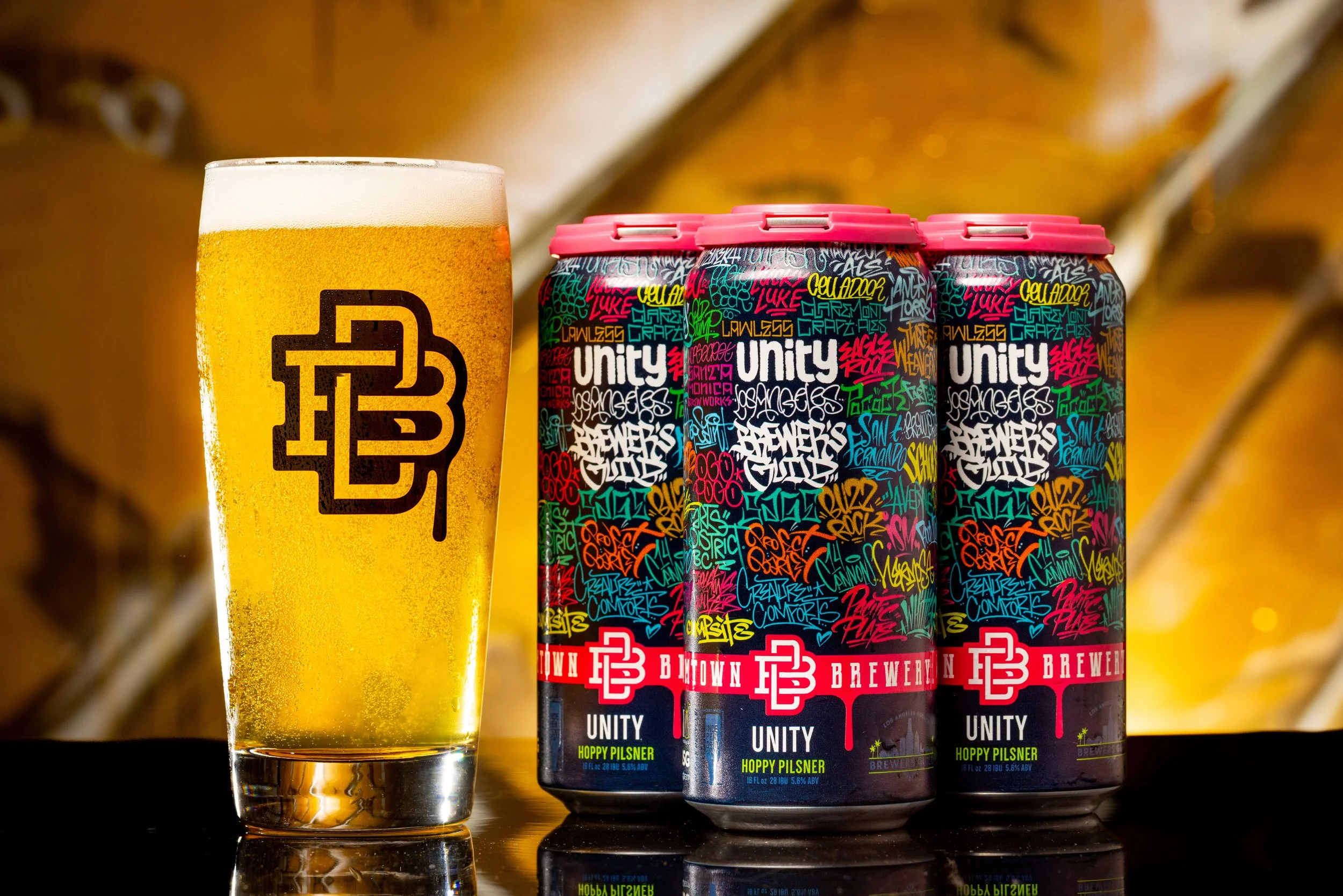
One of my favorites was the UNITY brew design. Every year a different brewery gets to create the flagship beer for the Brew Week event in LA. The idea was a “roll call” can where I tagged the name of every brewery in the Brewer’s Guild. A great honor and I know it was a big hit with the crowd.
Of course it wouldn’t be a brewery with out great merch. Working with John R, we create some really classy new gear to go along with the updated look of Boomtown and Bad Hombre.
We even did a photoshoot of me and my van, following me as I paint a wall. I definitely felt pretty special being the star of the show for a day.
Lastly I just want to say how awesome it is to create the design for Graffiti IPA. It was my first artist series can design. I have always collected old Krylons, so when it came to an idea for a unique collectible beer. Making a spray can was so fun for me. Its been 4 or 5 years now where we do different colors and its always a hit with our fans.